8 Proven YouTube Thumbnail Design Tips for Better CTR
What is a YouTube Thumbnail and Why Does It Matter?
As you guys already know YouTube is the biggest video sharing platform in the world. Millions of creators, and millions of videos. But what makes those videos special and how it reaches you, and how does your mind let you respond to click on it? Ever thought?
This thumbnail is the first thing that attracts us. Maybe the content quality is not so good, but if you win in attracting audience to your videos, you are really creative. In the SEO field this thumbnail decides the CTR which is simply a term we used to describe how much your content is visible and clickable on YouTube. And sometimes, your videos rank lower but still attract audience because of your thumbnail that draws them in.
Why Thumbnails Affect CTR and Video Ranking
On YouTube, CTR (Click-Through Rate) is one of the strongest signals the algorithm uses to decide whether your video is worth promoting. Every time your video appears in search results, the homepage, or suggested feeds, YouTube measures how many people actually click compared to how many times it was shown.
If your thumbnail is weak—low contrast, cluttered, or unclear—viewers will likely scroll past it. This leads to a low CTR, which tells YouTube that people aren’t interested in your content. Over time, the algorithm pushes your video down and gives more visibility to videos with higher CTR.
On the other hand, a well-designed thumbnail instantly communicates what the video is about and why it’s worth clicking, even before someone reads the title. By increasing CTR, your video shows YouTube that it’s attractive to viewers. This creates a positive loop:
- Higher CTR → More watch opportunities → Higher chance of engagement
- Lower CTR → Fewer recommendations → Declining visibility
So, thumbnails don’t just affect whether people click—they also directly influence video ranking and recommendations within YouTube’s algorithm. You can also use our tool (our tool) to download others' thumbnails too, and it’s not against copyright guidelines.
How a Strong Thumbnail Boosts Impressions and Engagement
A strong thumbnail doesn’t just stop at clicks; it affects how often your video gets surfaced and how viewers behave after clicking.
- Boosts Impressions: YouTube’s system prioritizes videos that generate clicks. If your thumbnail attracts more viewers in the first few hours, the algorithm expands impressions by showing your video to a larger audience across “Browse” and “Suggested.”
- Encourages Engagement: A thumbnail that sets the right expectation helps retain viewers. For example, if your thumbnail shows “5 Editing Tricks in Premiere Pro” and the video delivers exactly that, people stay longer, like, and comment. This consistent engagement signals quality to YouTube.
- Creates Brand Recall: Strong, consistent thumbnail styles (colors, logos, borders) train viewers to recognize your content quickly. This improves repeat clicks and loyalty, further boosting your engagement metrics.
What are the Recommended YouTube Thumbnail Dimensions?
The recommended size for YouTube thumbnail (youtube thumbnail) is 1280x720 pixels with a 16:9 aspect ratio. The appropriate file size must be under 2MB. I would recommend PNG size, because PNG is ideal for highest quality. If it exceeds the file size, you can also compress the file using Caesium.
Why Incorrect Sizing Can Hurt CTR
When you don’t follow these sizing rules, several problems can occur that directly lower your CTR (Click-Through Rate):
- Blurry or Pixelated Images: If your thumbnail is too small or low-resolution, YouTube stretches it to fit different screen sizes (TV, desktop, mobile). This makes text fuzzy and faces unclear. Blurry thumbnails look unprofessional and discourage clicks.
- Cropping Issues on Devices: An incorrect aspect ratio (not 16:9) can cause YouTube to crop important parts of the thumbnail. A cut-off face, missing text, or clipped logo reduces clarity and appeal, making viewers skip your video.
- Unreadable Text on Mobile: Over 60% of YouTube views come from mobile. If the thumbnail isn’t sized correctly, text becomes too small when shrunk to mobile dimensions (~320×180 px). Users scrolling quickly won’t stop if they can’t instantly read your message.
- File Rejection or Auto-Compression: Thumbnails larger than YouTube’s file size limit (2MB) or saved in the wrong format can be rejected or auto-compressed by the platform. Compression lowers image quality, leading to dull colors and reduced sharpness.
- Algorithmic Disadvantage: Poor CTR from unclear thumbnails signals low relevance to YouTube’s algorithm. Even if your video content is great, bad sizing reduces click potential, lowering impressions and discoverability.
Which Tools Can You Use to Create Professional Thumbnails?
You can use both free and paid tools which align to your need:
- Canva: You already knew Canva is now the widely used graphic design tool and it’s the best for creating any type of thumbnail. Canva has easy drag-drop functions. You can use any custom templates too. Multi-layer text and image editing and easily export files in any format. All the viral thumbnails nowadays are created mostly with Canva
-
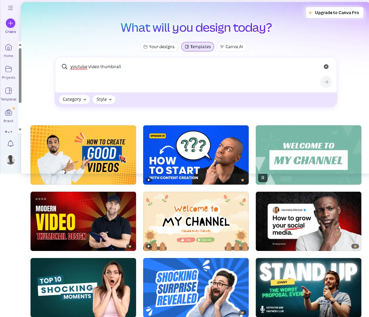
Example of Canva interface for thumbnail design. - Photoshop: Photoshop is professional software. In case you are familiar with this, you can add, crop, remove, paste anything or if you find it complicated to work with, here's a video guide you can watch.
-
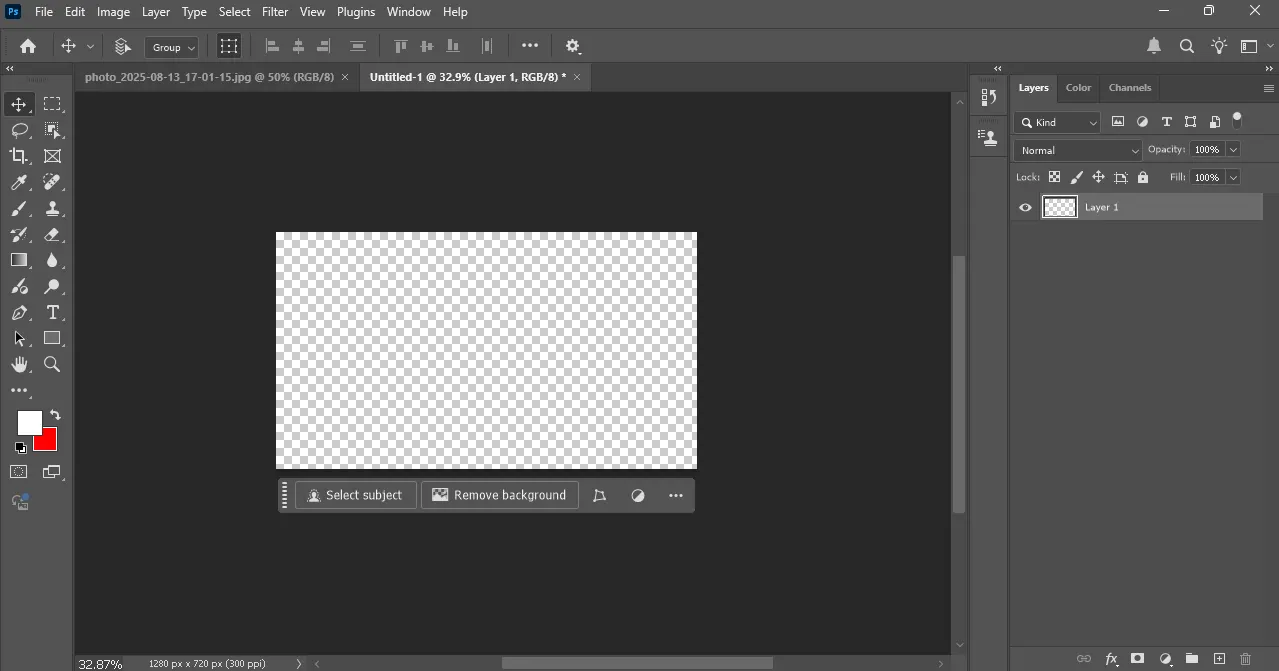
Photoshop interface for thumbnail design. - Tip: If you don't want to download Photoshop for any reason, you can try its alternative Photopea which has similar features and same functions as Photoshop. This tool works online, so you don't need to worry.
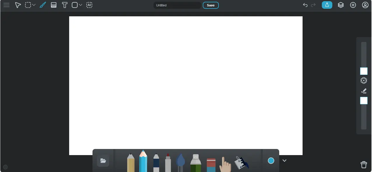
- Sumo Paint: Sumopaint is another online tool which is easier to use and learn. Personally, I really like its simple interface. You can add gradients, shapes, paints, text formats. It also has AI generative features so you can generate AI stuff for your thumbnail.
What Are the Best Creative Design Tips for Higher CTR?
- High Contrast Colors: High contrast colors make an aggressive impression to users to click on it. It's color psychology; different colors represent and impact our different moods. Use complementary pairs from the color wheel (like red + green, yellow + blue). Text color should not blend with the background. Try different color patterns and compare how they will be visible to users.
- Face Close-Ups: Faces are powerful click-drivers because people connect emotionally with expressions. A thumbnail showing a clear, expressive face communicates emotion instantly and invites curiosity. Our brains are wired to notice faces first—especially eyes and smiles. This builds trust and triggers clicks. Try different face expressions that aggregate users to have interest. Apply a large cutout of the face so it makes more sense. Background should be clean and should not blend (white or black) so your face will shine in the thumbnail.
- Avoid Text Clustering: Text in the thumbnail should not be long enough. Viewers scroll quickly—short, bold text ensures they understand your video in a split second. Use large, sans-serif fonts for clarity. Keep text in uppercase for uniformity. Title is the second thing users see, so make it clickbait-able that resonates with the thumbnail.
- Tip: As I said, your text should not blend with the background; if it does, apply shadow effects, glow effects, or bold text outlines to create a separation that makes it easy to read.
- Add Target Elements: Target elements mean add those things that you want to show. If you’re making a gaming video, then consider putting the image of that game; if you are telling about any lifestyle or fashion, then put pics of fashion models that give a success or money aesthetic feel.
- Observe Results: As I told all the methods, try these and observe for a few days how much impression and clicks you got. Mix up all the techniques of text, images, etc., I explain. See how others make thumbnails in your trending niche. If you got rising clicks, then you are doing great. Then continue with that process for further videos.